Tag
statistical graphics
-

How to Create and Master the Histogram in R for Data Visualization
The histogram in R isn’t a static tool; it adapts to your needs. With base R’s `hist()` function, you can quickly generate distributions, but the real power...
-
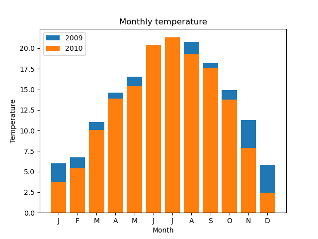
How to Create Stunning matplotlib bar chart Visualizations
What sets the matplotlib bar chart apart is its ability to handle complex data structures while maintaining clarity. From horizontal to stacked configurations...
-

How 3D Graphs Are Revolutionizing Data Visualization Beyond Flat Charts
What distinguishes a 3D graph from its 2D counterpart isn’t merely added axes—it’s the ability to simulate real-world dimensions. Imagine plotting stock market...